
Apr
2014
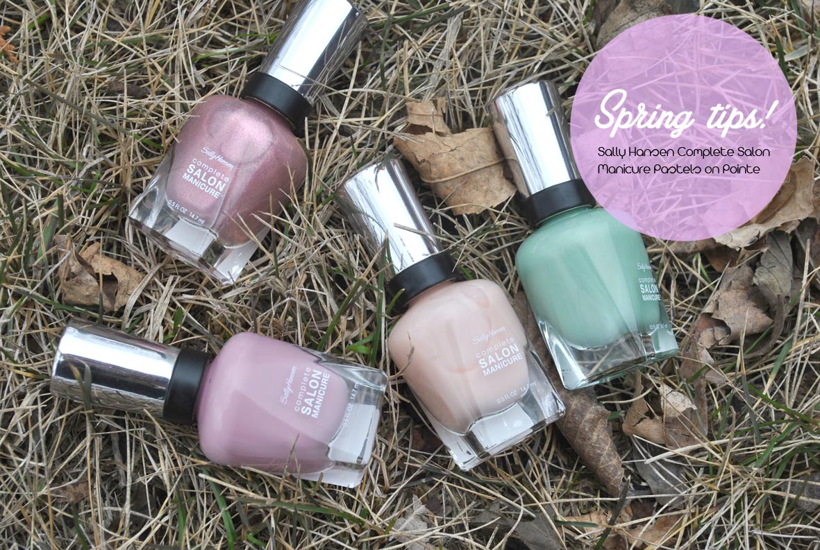
Spring tips! Sally Hansen Complete Salon Manicure Pastels on Point collection
With the weather (slowly) getting warmer, my nail polish colour cravings have gone from drab, wintery colours to fun, sleek pastels.
Being a huge fan of Sally Hansen’s Complete Salon Manicure (CSM) line, I was excited to get my hands on their spring collection, Pastels on Point. With dance-inspired names, the collection features pastel shades, as well as iridescent hues that can worn alone or over top of another colour to create a holographic appearance.
There are six shades in the collection which launched in April 2014. I got my little hands on four of the shades, three of the pastels and one of the iridescent ones.
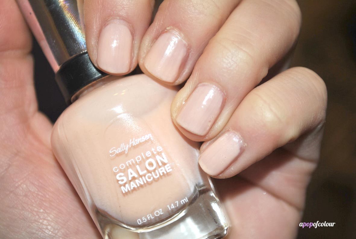
Cur-tan Call is a peachy-nude shade that is my favourite from all the colours I received. I have been huge into nudes and peaches/salmons so when I laid my eyes on this colour, I fell in love. The texture is a cream and quite sheer, so I used three coats to make this opaque (and even then it’s still a little sheer). If there is one colour to pick out from this collection, I would go with this one.
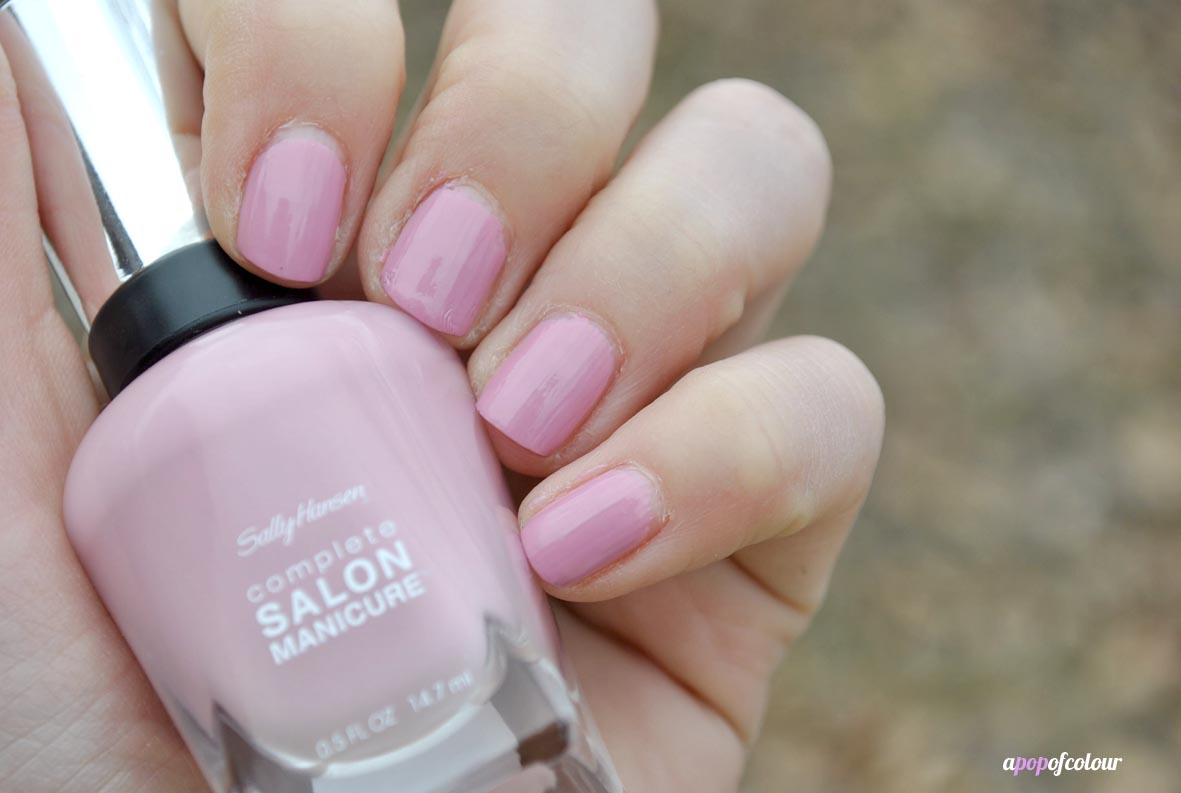
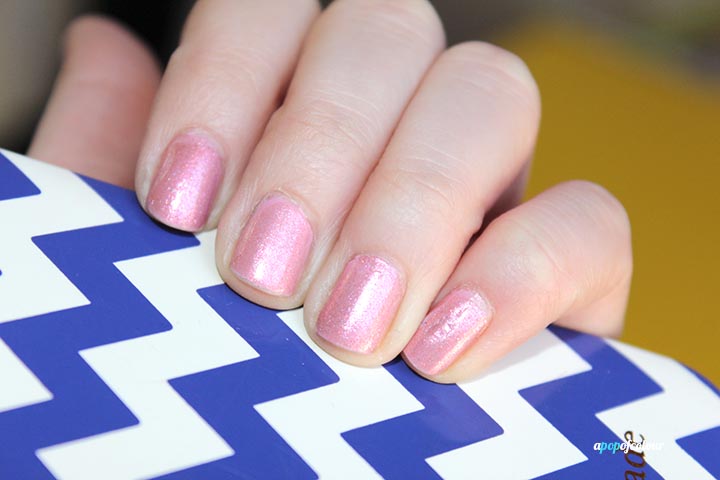
Don’t be Leo-Tardy is a creme mauve pink. I feel like this shade is highly dupable and a staple in any spring collection (as well as anyone’s nail polish collection in general).
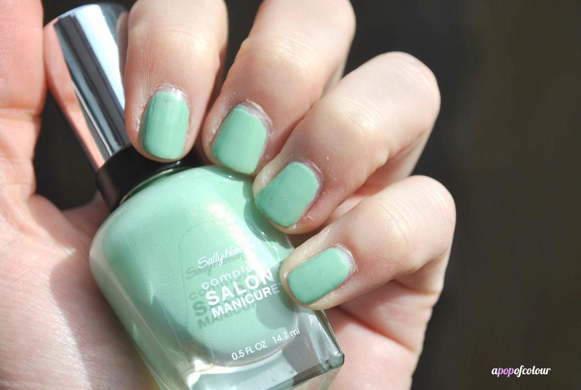
Pique Side is a muted mint green, that, at first glance, looks like a creme, but if you look real close, there is a bit of shimmer in there. With that being said, once painted on you don’t notice any shine. This shade is actually very similar to Sally Hansen’s CSM Mojito shade from the Tracy Reese Spring 2014 Designer collection that launches next month. They are almost spot on.
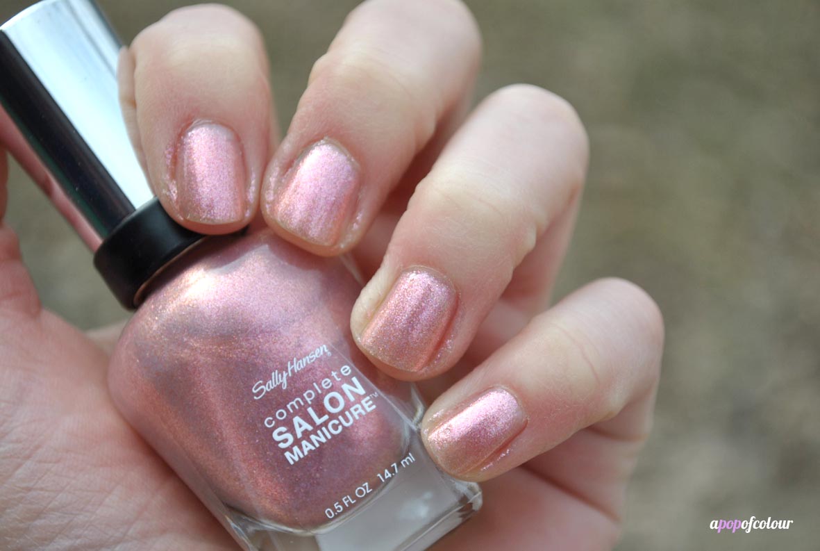
Tutu Pretty overtop of Don’t be a Leo-Tardy
Tutu Pretty is one of the three shimmery shades in the collection. You can choose to wear these alone or over another colour in the collection to add some holographic shimmer to the look. If you sport these worn alone, they are quite sheer, I used three coats and it still wasn’t opaque. Although I do prefer these over another shade, they are a nice hint of colour.
I layered Tutu Pretty overtop of Don’t be a Leo-Tardy and was actually quite surprised on how much I liked this combo. Tutu Pretty transformed the pale pink into a gorgeous rose gold shade, making it on trend for summer.
There are also two more iridescent shades in this collection, Take the Leap, a lilac shimmer, and Tulle Kit, a blue shimmer. Overall, I do like this collection, however, I feel like the colours aren’t really anything that I haven’t seen before from other collections or brands. It’s a typical spring collection with the pastel shades, but I do like how the shimmer holographic colours really spice up the overall look of the base colour.
Have you tried any shades from Sally Hansen CSM Pastels on Point collection?
Please note, I was sent this product from PR. All opinions are my own.
Like what you read? Check out these related posts:
- Incredigel? Sally Hansen Salon Gel Polish Starker Kit
- Catwalk colour! Sally Hansen Complete Salon Manicure Designer collection 2014
- The easy gel mani: Sally Hansen Instagel strips
- Fast and dry: Poshe Top Coat